
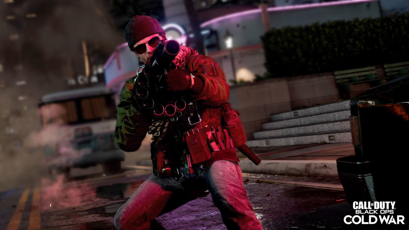
Following our giveaway for the digital store card for Battlefield, it’s time for one lucky reader to snag a free copy of Call of Duty: Black Ops Cold War on us! This Black Ops Cold War game giveaway is open to anyone worldwide, and all you need to do is enter with the instructions below.
Important to note: If you’re the winner and you choose PC, we will send the code as a digital gift; same with the Xbox One/Xbox Series X version. However, for the PS4/PS5 versions, we’ll mail you a physical disc (since there’s no way to gift on the PlayStation Nework), or we can also send a $60 PSN gift card if you prefer that.
(Click the link if the giveaway widget isn’t showing up for you).
We’re stretching the giveaway until the weekend to give everyone a chance since this is open worldwide. That’s basically it! While we’re giving the game away, we’re also looking for feedback for the site redesign we’re launching soon (MP1st has been running on the same site since its inception).
Make sure to look out for our Black Ops Cold War review hitting the site soon.
More Black Ops Cold War Reading:
First, thanks for doing another giveaway! Very cool. Second, as far as website revisions go, I’d like to see less extraneous advertisements popping up, and I know that’s a big ask as ya gotta make some bread on this deal but a good chunk of them are website breaking. They prevent the site from loading correctly. Aside from that, maybe something that is a bit more dynamic with Forever scrolling and being able to pop in and out of articles without completely loading up a new page. Good luck, I know website redesigns are rough. Especially when you’re used to the way it currently looks and works.
More content other than Call of duty related
Yes. Definitely. We’re brancing out a lot since we don’t want to be pegged as just another COD website. We’re pouring more resources into guides, fighting games, etc.
A redesign that is intuitive to somebody who is used to the existing layout
I hope this give me back Call of duty 2 vibes and black ops one i loved modern warfare i hope this is the same like that.
I enjoy the current layout so I just hope the new design doesn’t stray TOO far from it. Maybe a page with expanded categories like you have displayed on the right hand side, then you can easily search for a game you’re interested in and get all relevant news.
its nice as is right now i just hope it will have more ads related to what your looking at
I think the ads are geo-targeted and depends on what you browse online. I have to check.
MMMMMMMH let’s see
I like the layout so far just wondering why the x on the video ad is so small.
The upper top of the website is a bit covering the content of the pages, so might wanna change that a bit
Dark mode should be reviewed for readability
Dark mode for sure
dark mode + the tabs on the top placed as one column on left indicated as 3 horizontal bars + red as hover color rather than orange.
REEEEEEEEEEE
Agreed, a dark mode would be great. Maybe a way to “continue” on a mobile device if viewing on PC?
a giveaways tab and maybe an interactive changeable background but that’s too fancy
That one makes sense (giveawa tab). We’re going to start giving games away every month, as well as digital store cards for an upcoming top plays thing. 🙂
This looks awesome. I’m super hyped for the giveaway, and so is my brother!!!
I wish there were less ads
Which ones are most offensive? Not joking here, but we value the user experience a lot. Screenshot it and send it to my email or Twitter (https://mobile.twitter.com/excaliburps). I promise, we’ll take a look.
Honestly it’s not the type of ads, it’s just the amount of them. If you want to make it a better experience (at least for me) maybe cool down on the ads, especially the ones linking to articles, as those are usually the most offensive. One thing I can say about at least most other gaming websites, is that they tend to advertise mostly gaming stuff, even the custom ones. Another thing, if you’re on the website, it’s constantly refreshing to ad more ads, and that’s annoying. There are ways to get moving ads that don’t have to refresh the page.
Hyped for the giveaway!
Dark mode is a must. Also your header overlaps the top post on the main page. On mobile btw not sure if it’s like that on PC
Just an Overall smoother experience with dark mode as everyone likes that.Maybe just try make it easier to find things.Else I dont think it need much more. Their are also quit a lot of ads so try reduce those as those push away viewers.
I’d like to be able to enable dark mode. Also would like to see an ability to customize colors to your own preference. For example when hovering over “News” and etc…
I would love to be able to set it to Yellow and have dark mode enabled, so the site is Black and yellow.
Exciteddd
Fingers crossed!
Needs a Dark Mode for night time, feels like a flashbang went off in my room
Dark mode definitely!
I would love to see the mobile interface get fixed. Cause its kind of slow an laggy for me. Not sure its just me. but I never had any problem like this with other mobile site s Twitter : CareWesh
it’s not just you, and this is something we are looking into for our mobile version in the redesign!