
COD Vanguard Early Access Beta Code Giveaway

In case you didn’t know, this weekend is the start of the Call of Duty: Vanguard early access beta for PlayStation gamers! Thanks to Activision, we have a slew of keys to giveaway!
COD Vanguard Early Access Beta Code Giveaway Mechanics:
How to win one? Super simple. “Give us feedback the MP1st website! Good, bad, cruel, doesn’t matter, nothing disqualifies you potentially winning a code. We want your honest opinions, so don’t hold back! Just leave a comment below, and if it’s a good answer, we’ll send you a comment. Leave your Twitter handle or a way we can contact you, so we can directly send you the code.
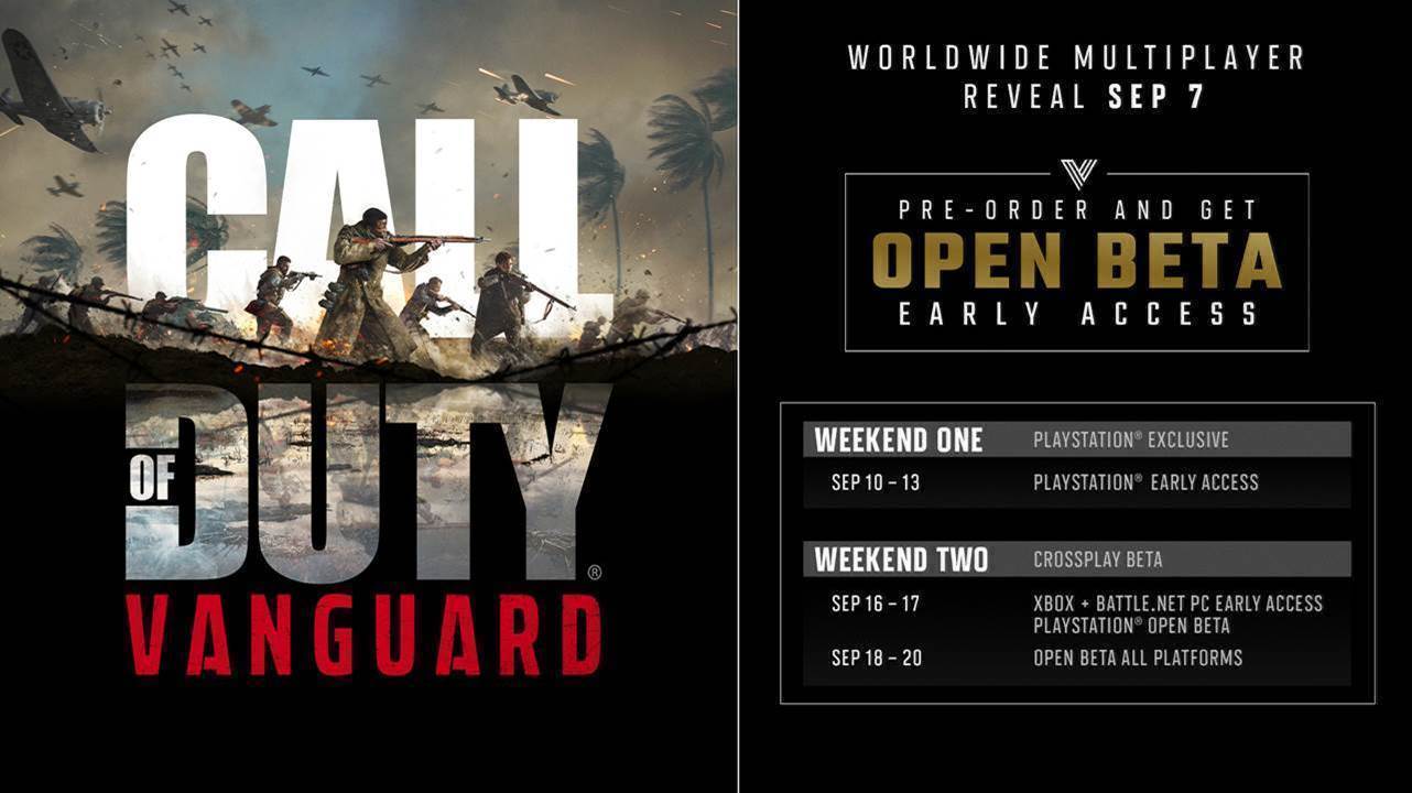
COD Vanguard Early Access Beta Schedule (for PlayStation):
September 10-13, and 16-17
Stay connected to MP1st and the latest news by following us on Bluesky, X, Facebook, TikTok, YouTube, and Google News.
I’ve always known you guys to be ahead of the game and report on stuff before other sites; that might have slowed down a bit but you guys are still great IMO. @mendola101
You’re website is pretty good overall :).
Honestly, the website is pretty good. It actually works well on mobile which I mostly use. And easy to see what is the top stories. Twitter: @zannicastro
I really want to try the beta because the multi-player looks promising.
Good website for news on cod! Twitter @ AlexVanaris
Too many ads for my taste, but i get it. Also i would love a dark mode! @pahissonni
Which ones are the most offensive?
I rarely like any ads, but the one i dislike the most is the video ad/trailer that move with you when you scroll.
Noted. We’ll see if it’s worth keeping around. You see it in mobile, yes?
I’m on ipad.
honestly,I found this site 1 month ago and I’m really happy about it,one of the few sites I check daily for news about gaming,about the giveaway,you can contact me on Twitter:Cheeki_COD
I like your website. Good and trustable info here
I really like this website, it’s very intuitive! @goldieuptown
It is a very good website with many options to look on the headlines and the Game news is fantastic. This is a good website for people who wants a overall news for gaming. Twitter @Lagilyas
I would really like to read opinion pieces from you guys. Just in general about the state of gaming @The_g0d_f4ther
MPFirst Writing Feedback isn’t my thing i’m not that great at explaining things here goes nothing, I like that you guys release news in a timely fashion, I also like the fact that you guys have an organized and sleek page. @VisionThaGoat
The website overall is a good design, everything is simple, and easy to navigate. I also like the fact that there isn’t ads littered all over the website, great job guys!
My Twitter @ is @HaloPlayz
love the website and all the positive comments coming from it.
A Dark Mode Is Needed as My Eyes Are Beginning to Burn. Great Source of Cod News. @IrrelevantBoi05
Not a bad website a little buggy and ads but I get it cause ads gets you guys money so I’m not hating but will say so far I enjoy this site. Even if I don’t get a code I will still check out MP1st cause it seems dope tbh. Also my Twitter is @PlayboiHoodie
When accessing the website on iOS the top heading bar is difficult to access. It doesn’t properly appear. This makes is hard to access the menu tab at the top. @realZoso
Viewing the main screen of the site on an iPhone using landscape is a little weird, a lot of the screen is empty and all the articles and shown on the left side. Besides that though it looks very smooth. Twitter is @DontBame
When accessing the website on iOS the top heading bar is difficult to access. It doesn’t properly appear. This makes is hard to access the menu tab at the top. @realZoso
Also to add on my other comments the ads that follow you as you scroll are annoying. You have enough ads already and having one follow you as you scroll is enough to make people want to click off quickly. I’d also add a dark mode
The ads are invasive, at least on mobile. Otherwise the site is well structured. The ads are the only problem, in my opinion.
Twitter: @Snooze183
When accessing the website on iOS the top heading bar is difficult to access. It doesn’t properly appear. This makes is hard to access the menu tab at the top. @realZoso
I remember checking this shit almost every hour to get any news about cod and bf back in the day and still i like your coverage for cod but what i like the most is that the content on this site has expanded on other games too. Also love the constant giveaways. Appreciate it. One criticism i can give is about the ads. I know its good for you but i don’t like to open an article and get bombarded by 4-5 video pops ups and ads. Other than that good job. Keep jt up. @PownNoobs_96
There have definitely been improvements over the years to the site. The ads can be a bit annoying at times but an ad-blocker handles that (I know you guys don’t want them blocked but on mobile it is almost a necessity. I think this was mentioned below but a dark mode would be the bees-knees for my poor aging eyes =p
Keep up the great work!
there is a bit of ads more than I would prefer but they are kind of random like I get ads for stuff that I have no interest in. also like someone else said a dark mode would be awesome but I like the cod articles I’ve seen so far
twitter is @playboihoodie
Oh boy I had ad blockers on when I left my comments and HOLY LMAO did they come out looking all types of bad. Almost all of the words I typed ended up bunched up together. Hopefully that doesn’t disqualify me since it looks like a bot typed that nonsense out.
Although others have problems with ads I, I don’t see to have any ads at all oddly enough maybe it’s a mobile thing. The only thing I would really want to see changed is maybe a dark mode for night time usage.
@myaccount52
honestly,I found this site 1 month ago and I’m really happy about it,one of the few sites I check daily for news about gaming.
Twitter:Cheekii
Ads are a tid bit intrusive but other than that it’s pretty good, would appreciate a dark mode of the website, would make late night reading like now a bit better. Other than that it’s a great website!
Twit: @xzxfrostfirexzx
Ok this is a comment to address my last 3 comments and I hope it does not come across as spam. However when one checks to see their post history with Vuukle by clicking the bell I see my previous post but they all look jumbled as if my spacebar was broken. Also it seems that some of my previous post seems to have been cutoff.
Website is very simple, structured well and responsive by that I mean all the content is accessible on a range of my devices including my laptop and tablet and overall the news is easy to get to which is great. Colour scheme of the site is also great. Only thing I would say is increase the text size slightly on smaller devices (my tablets screen is just over 10″).
My Twitter is @TankGrimes
The site feels nice and organized only the ads on mobile are pretty intrusive and a dark mode would be a great addition to the site. @ikbenIan_ is my Twitter handle, I appreciate you giving away BETA codes!
Website is pretty boring would prefer a better ui design and maybe better mobile optimisation as the ads take up a lot of space on the screen.
Twitter – “typunknwn”
Just put a visible dark mode slider my man.
I agree with everyone else ads are a bit overwhelming for me. I feel like they disturb the content I am trying to read. I saw that everyone wants dark mode, but wasn’t that added already? Was it removed? I also think that the heart/like feature is broken I can like multiple times as long as I refreshed. That would give you the wrong stats on how many people actually like the article. Besides that great colors for the UI of the site, straight forward website layout, and good articles.
Twitter: @garfias_giovani
The site feels nice and organized only the ads on mobile are pretty intrusive and a dark mode would be a nice welcome. @ikbenIan_ is my Twitter handle and I appreciate you giving away BETA codes!
Having the “Submit a Tip” twice at the top right of the screen (in the red ribbon AND the main menu) is a bit much.
Didn’t see this, but I agree too!
The website layout is a little basic, it doesn’t strike you, a way to make yourselves stand out is to have a more unique and striking layout potentially to help stand out!
Twitter @ : meshfansonly
Best of luck!
I like the new layout, more news on the central page it makes better than the old design to me.
TW: @BubblyEze
I feel as if a dark mode should be added and utilized. Also, there can be some polishing in the sidebar such as the non repetition of submitting a tip.
twitter: JohnJoseph16386462
This might be the first time entering this website but I’m a huge fan. I don’t mind coming here again to read news
@KingZairy
I enjoy the website but I would like to see more E-sports content and also more form content creators. I think it would be great for a gaming site to partner with youtubers and streamers to interview and post info for there comunites to read. I also think it would be great to show off some of the smaller creators as well, so people can expand there viewership to people they have not heard of.
Communication and relationship with the customer, updated content, personalization of the information offered, interaction and participation of users. All these points are main for the website! lacked the dark mode option that much like today sites have. And a good part we meet here. my twitter is @dreellosk
Thank you for this giveaway! The UI is good. I agree with the others, a dark mode would be good. I checked the guides – dunno how old this website is, but the list of guides is very small. I bookmarked this website (looks promising) and added it to my whitelist on Adblock. Please keep up the good work. Good luck to everyone and cheers :). Twitter handle is @RinGoddard
Hi Mp1st!
I have a suggestion to give. The sidebar when you press the three lines at the top left of the page is a bit clunky in the way it comes up. Also there seem to be two “Submit a Tip” options in said sidebar.
Thanks for giving us the chance to get some codes 😀
My last comment got deleted 🙁 My feedback is simple the like feature on each post seems to be broken. Every time I refresh I can once again like the article. Unless this is done on purpose maybe this could get fixed… Also, too many ads it removes a reader from actually focusing on the article which they came to read. Just some thoughts. Great colors for the site.
Twitter: @garfias_giovani
Can you send a screenshot?
Yep sure here’s screenshots
And you aren’t following the MP1st Twitter, LOL!
Oops my bad lemme fix that right up. I follow you guys on my main but forgot to do the same on JENGUS
Twitter?
Main is @ADzahid7
Sure!
So it seems like the submit a tip issue got fixed since I can’t see it now. But to describe it, when I pressed on the three line button at the top left of the screen, the last two options both read “Submit a Tip”. One without an exclamation point at the end and the other with am exclamation point at the end. As for the kind of clunky way the sidebar pulls out, I can’t show that via a screenshot but the first few times I press the icon to bring the sidebar out, it kinda lags while coming up. Like the process of it going from left to right is sticky and hitches. Also it covers up the majority of the screen so maybe make that area covered by the sidebar smaller or make the sidebar transparent as a whole.
Hope that helps!
Mobile version is not optimised, ads are covering up alot. Secondly a dark mode would be preferred. Lastly website should be more dynamic like for example apple’s website, how its dynamic when you’re scrolling thru the product page. Interactive website would the best tbh
Twitter @luvmesomeonion
My last comment got deleted 🙁 My feedback is simple the like feature on each post seems to be broken. Every time I refresh I can once again like the article. Unless this is done on purpose maybe this could get fixed… Also, too many ads it removes a reader from actually focusing on the article which they came to read. Just some thoughts. Great colors for the site.
Twitter: @garfias_giovani
The website on mobile is clean, not clogged up by ads like other news websites. Very easy to navigate
Twitter: @CalumMcLauchlan